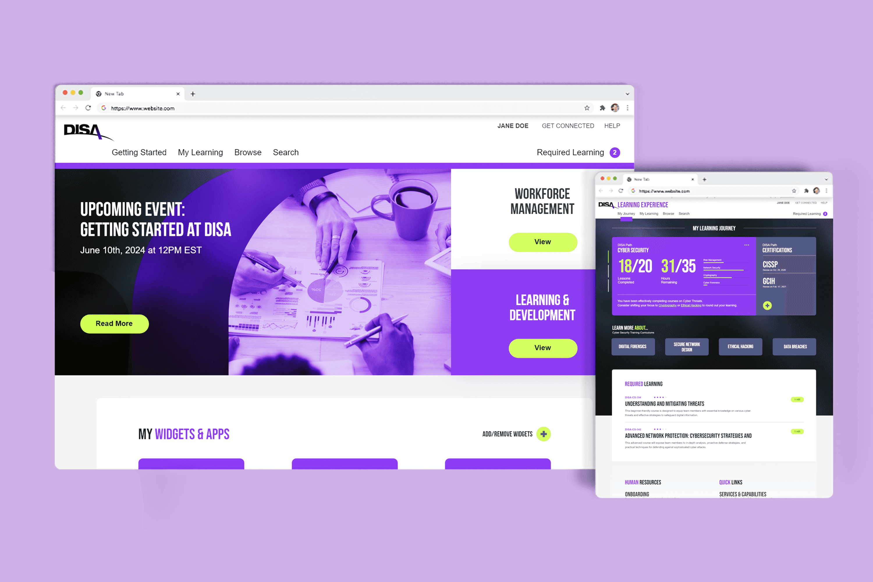
DISA HR and Training
A proposed product to DISA (Defense Information Systems Agency) to make their workforce training and community outreach within the agency more efficient.
The Problem
DISA (Defense Information Systems Agency) requested a new product option for their new HR transformation effort. Our priorities moving into the project were as follows How may we... 1) Make easy to navigate and track training modules? 2) Create A stronger awareness of community? 3) Provide more appealing visuals?
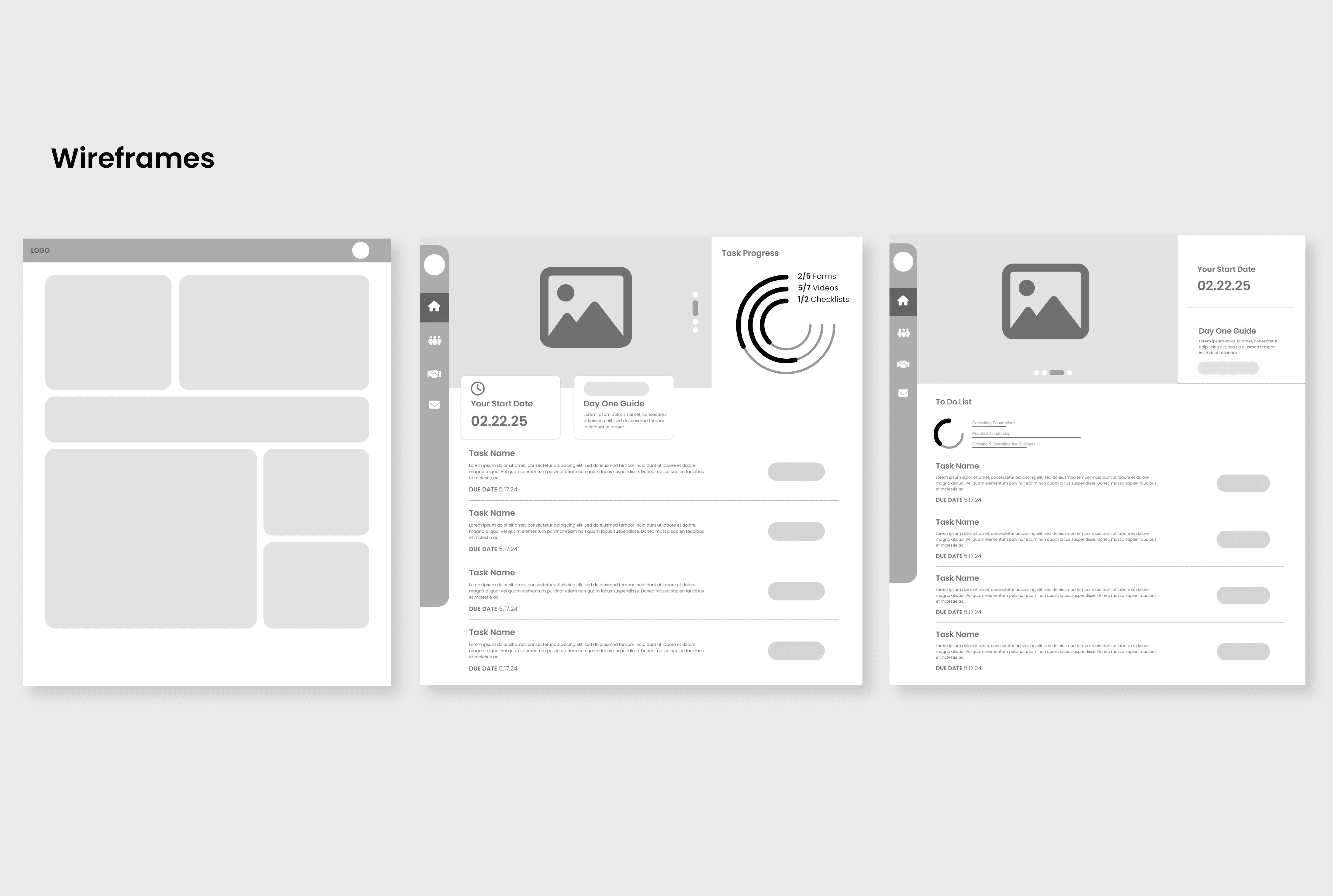
We started out with low fidelity wireframing and breaking out the concept into simple shapes. As we began to narrow down what we wanted to include in the design the wireframes went up in fidelity.
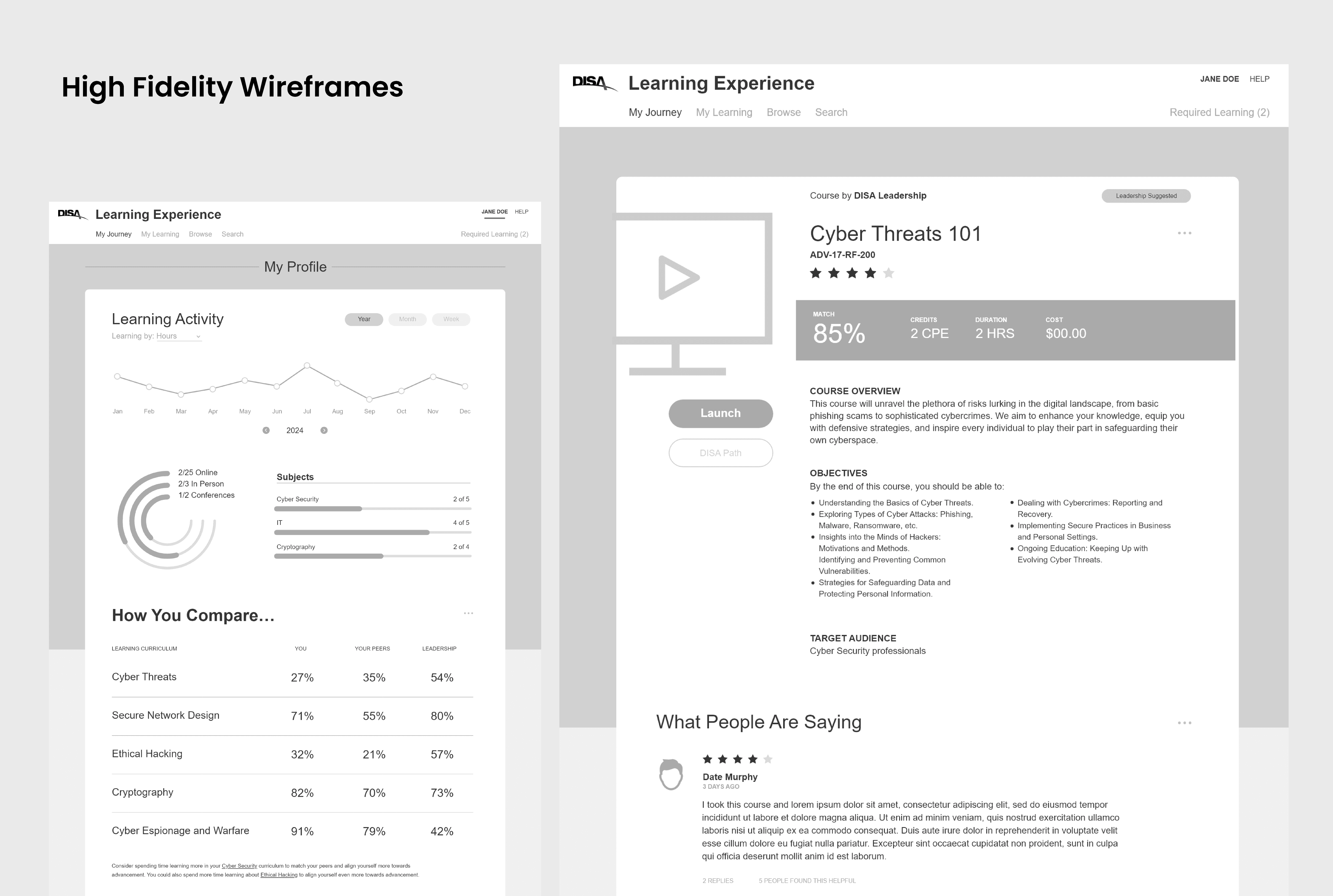
The highest fidelity wireframes that came out of the iteration sessions.
Final Solution
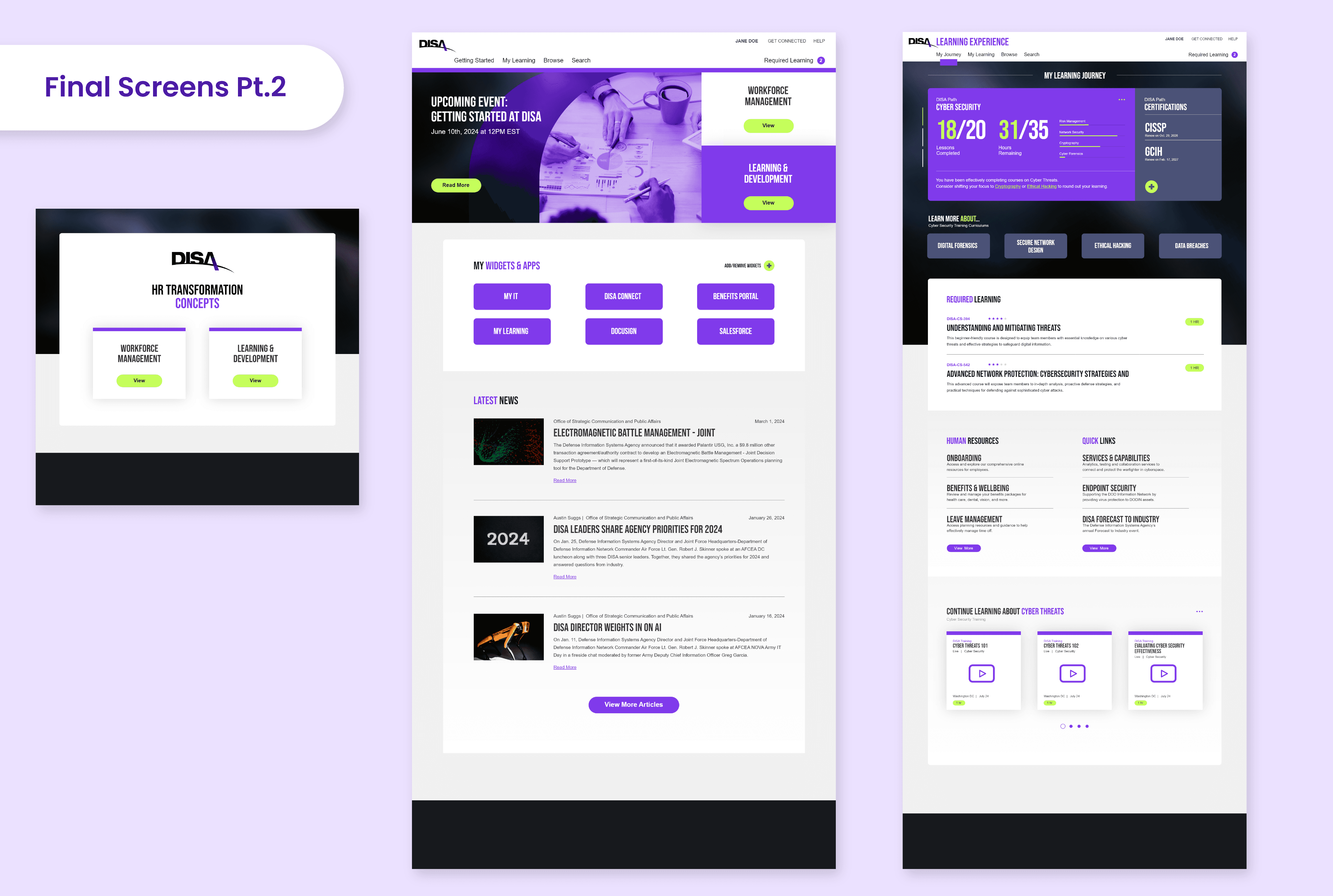
The final screens that were proposed.
The first two screens that were made final - these are almost entirely from the high fidelity wireframes of the previous images. We utilized the bright purple at the end of the DISA logo as an accent color throughout the entire design - complimented by a bright neon green as a third, less frequently seen accent for things like CTA (Call To Action) buttons. Other accent colors were used to make it visually easier to digest progression in training.
The remaining final screens. These screens used a banner to promote the sense of community that DISA was looking for by increasing awareness of agency wide events, and the latest news section ensures that there is easy access to the newest developments from DISA. By adding widgets and easy access buttons at the top for the user - we made it easier for them to find their learning and development goals. We added various learning milestone pages and easy ways to track their progress through visual data.
